Komoot is a mobile navigation app that provides outdoor enthusiasts with maps, trail recommendations and route planning for various activities such as hiking, cycling, and running. It's a great app for planning and discovering nature, and a great tool to enable weekends spent wandering out of the city. During a UX/UI Design bootcamp at Ironhack in Berlin, I redesigned the discovery flow of the Komoot app and also gave it a youthful rebrand to target a younger adventurer.
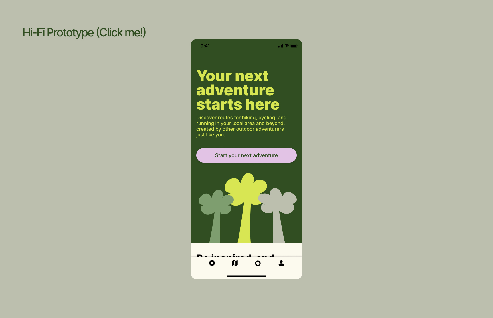
Click the photo below to open the hi-fi prototype and explore it for yourself in Figma. Try out the searching for a hike in the discover mode by clicking on "Start your next adventure", and then clicking on "Berkenwerder".
I redesigned the logo with brand mark and supporting brand name. I gave the previous logo an updated bolder and more youthful touch, and created a brand mark that looks like a mountain, a wayfinder, and also an avatar of a hiker.
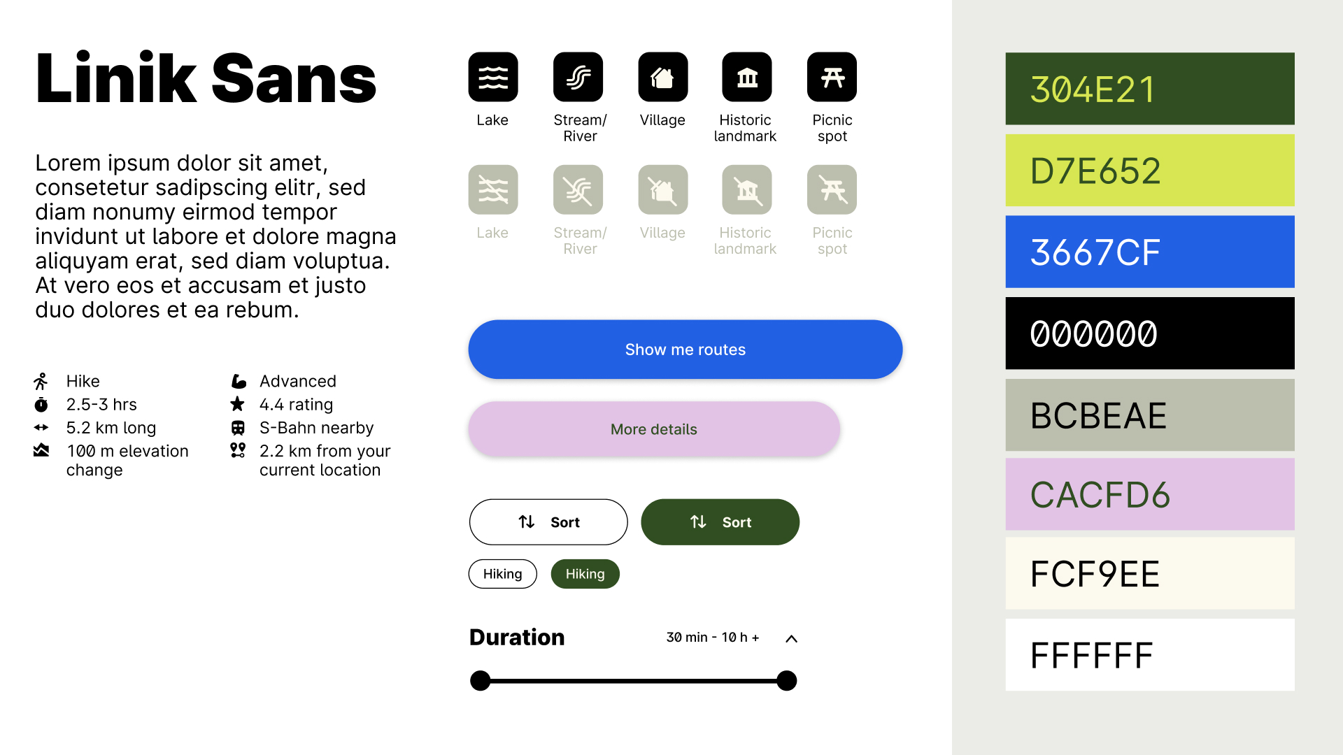
Outdoor equipment is often bright and colourful which I wanted to represent in the colour palette with a vibrant yellow-green and blue referencing the plants and water of nature and paired with a youthful purple of sports equipment. I chose to use just one typography Linik Sans for both the headers and the body text that is bold and rounded and feels youthful whilst also practical. The buttons are similarly large and rounded.
The project was to redesign an app of our choosing. I decided I would choose an app that would have a positive impact on mental health which led me to think of Komoot. The design and UX flow of the app seems a little dated and in need of some improvement. I decided to focus on redesigning the Discovery user flow which I had experience using before and also a feature the app does well compared to it's competitors. I also wanted to focus on redesigning with a younger beginner adventurer in mind, aged 20-35, which again isn't something komoot or it's competitors currently do.
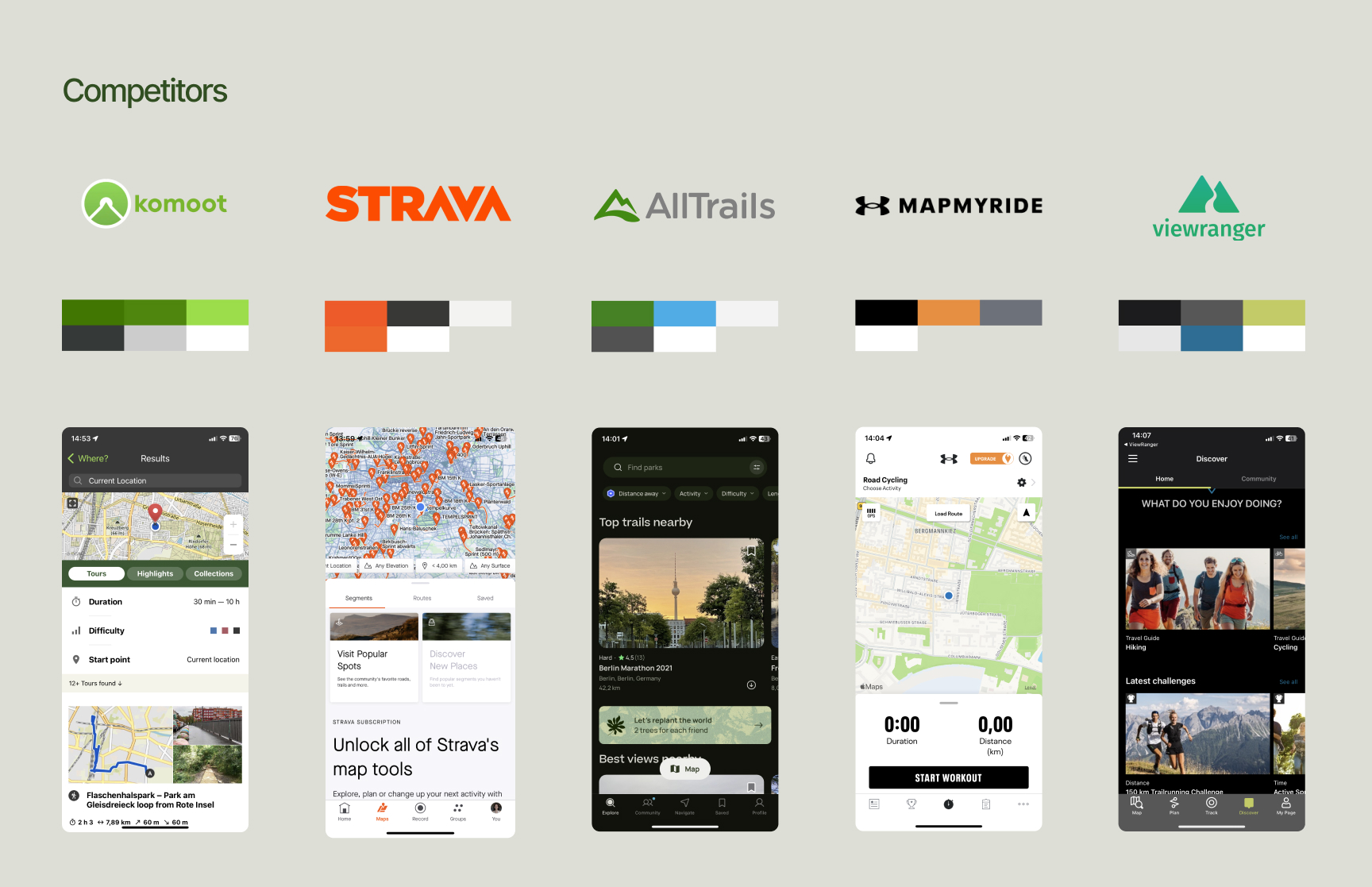
The competitors of Komoot include Strava, MapMyRun, All Trails, Outdoor Active, and View Ranger. All of these app have features such as real-time GPS tracking, offline modes, hiking/biking/running activity options, options to share your experiences with other members in the community. What seems to set Komoot apart from its competitors is that it targets itself towards both the casual and not only the competitive adventurer. Komoot for sure has performance tracking features, but seems less focused on the competitive feature, which is more enabling and encouraging for the casual or beginner adventurer — and perhaps also therefore a younger user.
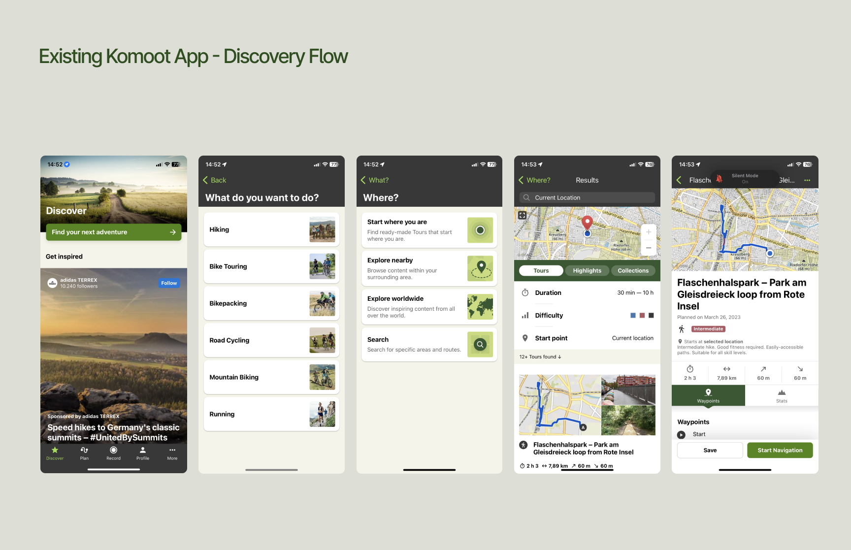
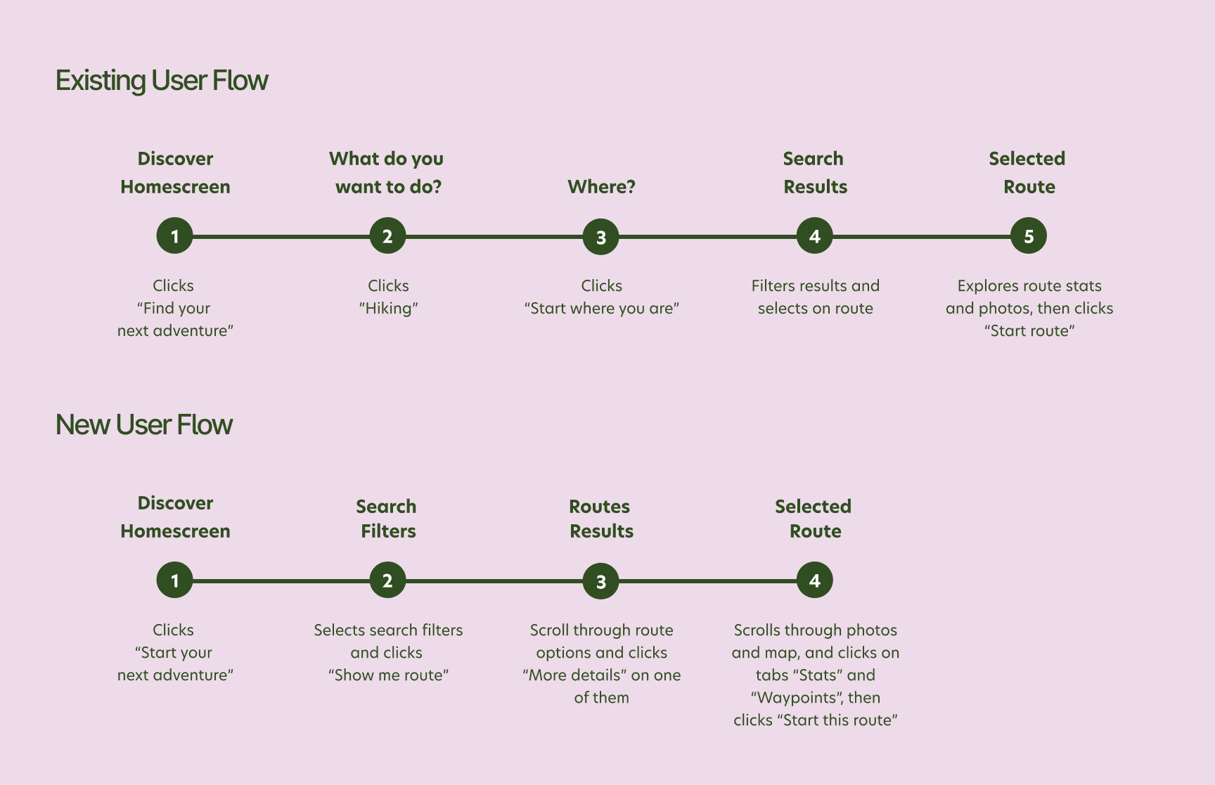
The existing flow is already quite short so I only needed to redesign the user flow so that the user applies all their search filters before seeing the resulting routes, which reduced the user flow by one step and also provides a better user experience. I also wanted to add further search filters such as "route highlights" and "transport distance" which are common considerations where choosing a hiking route.
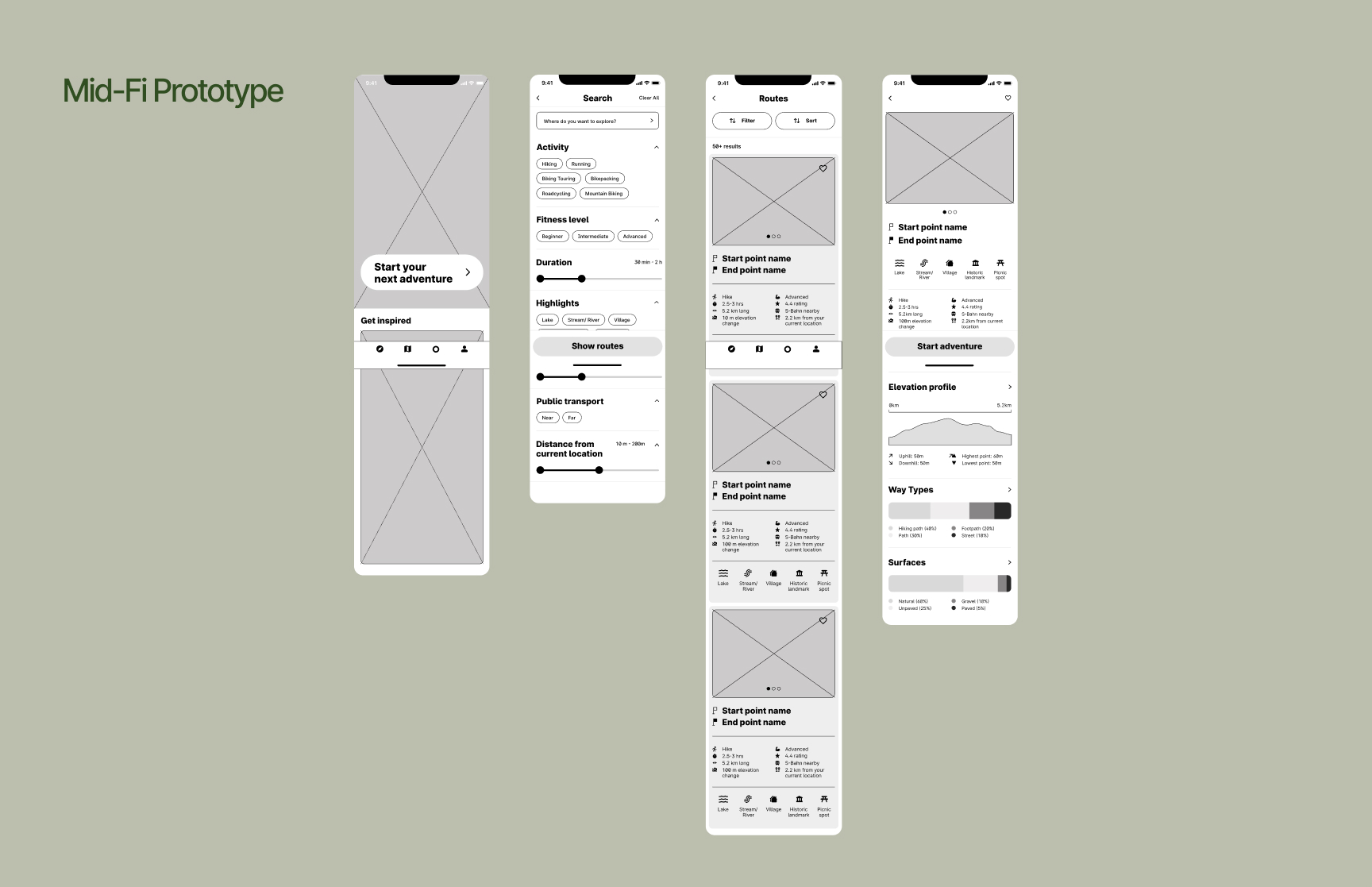
I designed a mid-fi prototype that focused on applying the search filters before seeing the results, including a new search filter for route highlights such as lakes and villages, and also being able to easily see those highlights and stats of the hikes at a glance when viewing the search results.
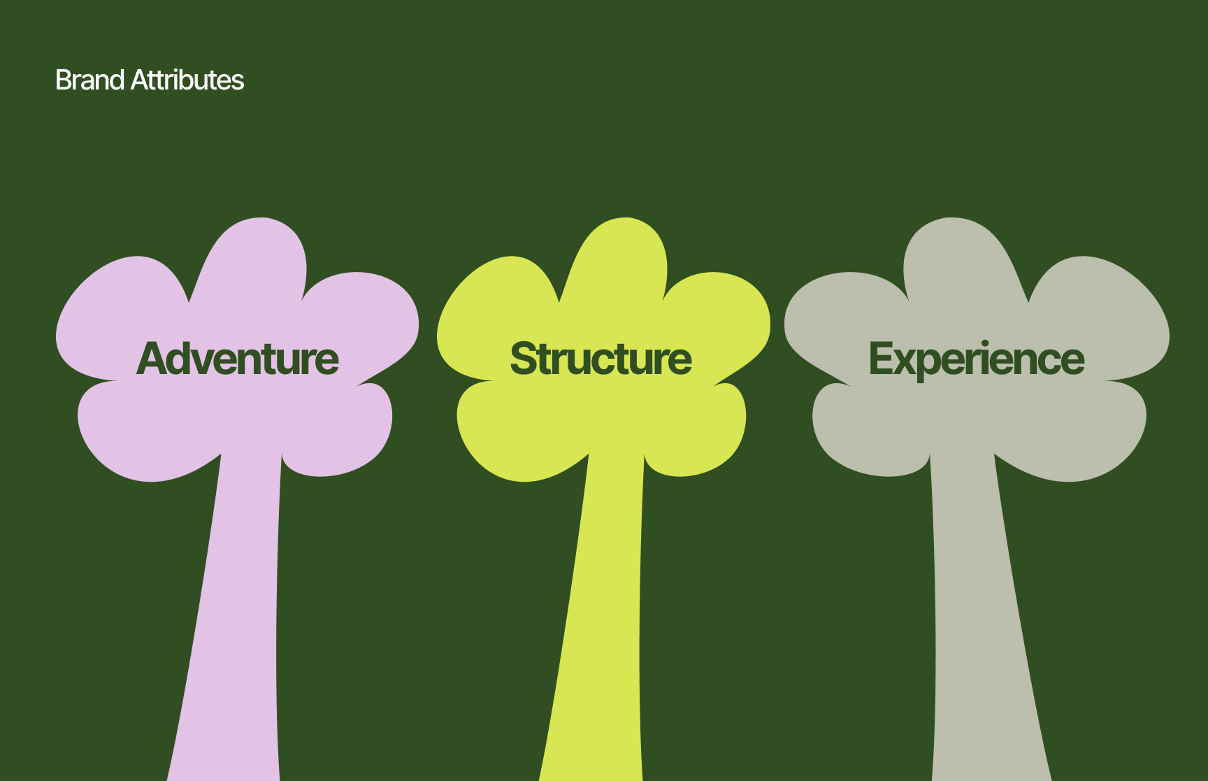
I chose the brand attributes of Adventure, Structure, and Experience to represent the rebrand towards a younger and more casual outdoor enthusiast. In particular, structure was important as the app enables users to plan their next adventure so it needs to also still feel clear and organised in its design.
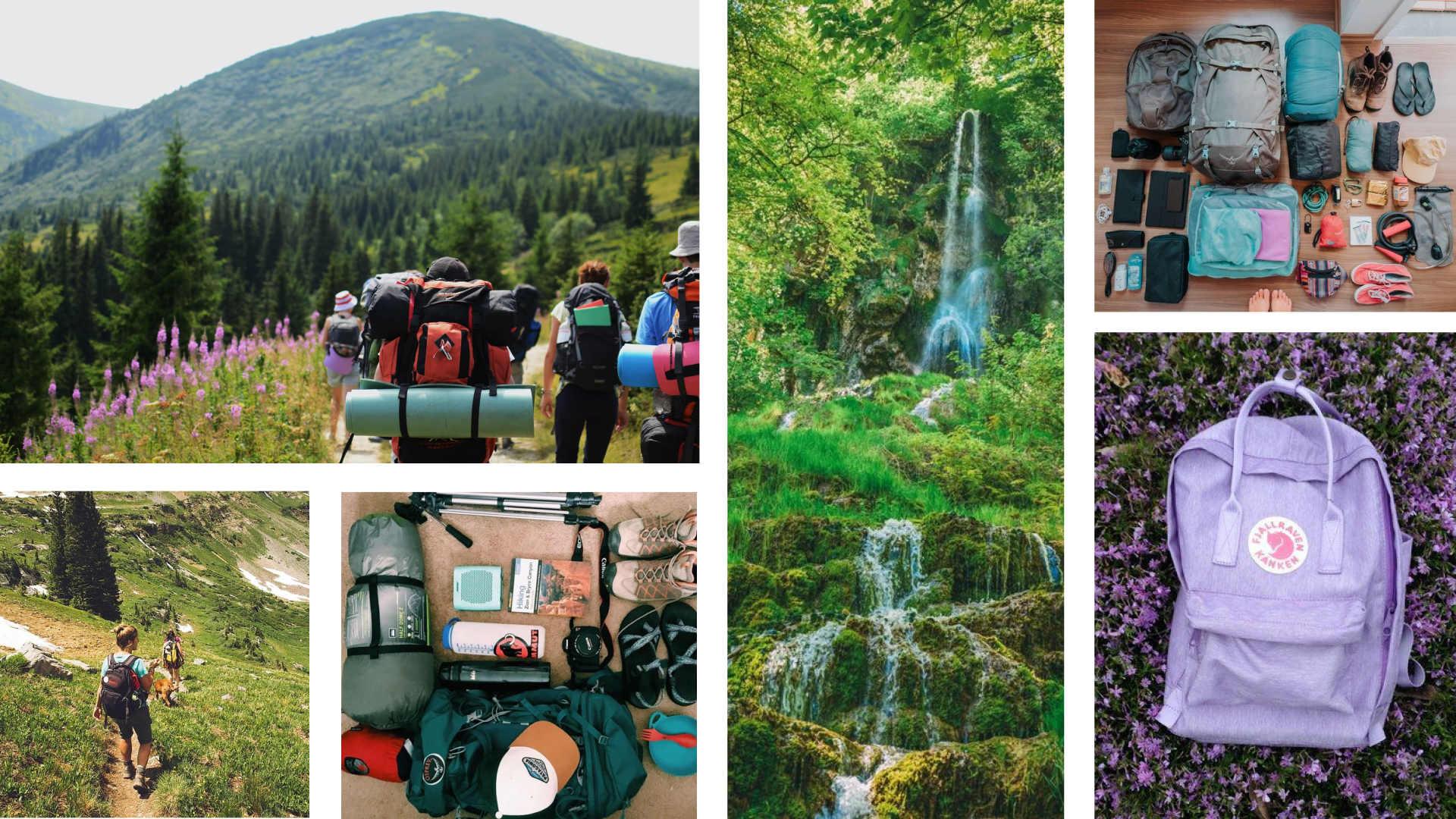
With these brand attributes in mind, I was inspired by the images I found of hiking adventures showing backdrops of forests, wildflowers, and waterfalls, and also of the groups of hikers gathered together with all their colourful hiking gears. This same colourful hiking gear is also shown neatly organised in typical pre-hike equipment photos. The moodboard inspired the colour palette of lime green and forest green of the plant-life, the blue of the water, the grey of the stones, and the purple pink of the wildflowers and hiking equipment. The branding of hiking gear is often also bold and rounded, which inspired the typography and UI elements.
This was an enjoyable project for me as it was focused on UI design and branding so I could mainly focus on my own opinion of what the design should look like. Though it would be interesting to have compared how the design would have turned out had I also done some UX research too.
On this student project, as I was pressed for time within one week, I skipped the low-fi prototype and also only did one version of the mid-fi prototype and very little testing at these stages. Though I'm quite proud of the resulting design, I recognise how it could be even better for the end user had I tested and performed more iterations of the design in the early stages of prototyping.
I would like to further test the design on current users of Komoot, to see how they feel about the rebrand and also to see how they feel about the pre-search filters. It would also be great to roll out the design to further areas of the app such as the record function and also the profile section.