betterplace.org is Germany's largest charity fundraising platform and it's also an NGO itself, meaning it's a not-for-profit organisation. For our final project during a UX/UI Design bootcamp at Ironhack, I had the pleasure to work with my class mate - and also now friend - Iara Forstreuter to redesign the betterplace.org destop website. Before even starting the bootcamp, I aspired to work on a project for them as I had used their website before and had found some of room for improvement in terms of the UX design and branding. We redesigned the fundraiser event creation flow, specifically with a 'Content Creator' user in mind. We also gave betterplace.org an updated brand identity with a new logo, illustrations, and design guide.
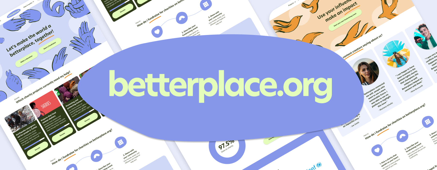
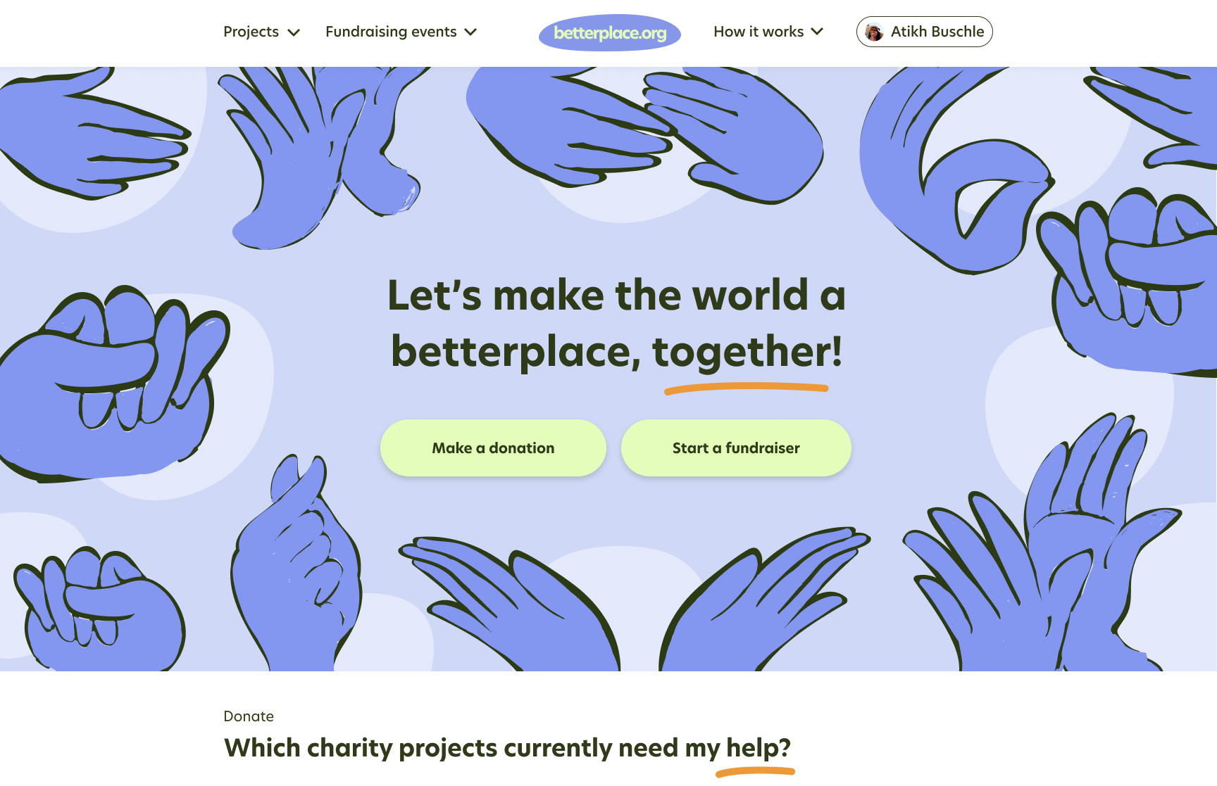
Click the photo below to open our Hi-Fi prototype design and explore it for yourself in Figma. Try out creating a fundraising event as a content creator from the homepage by either clicking directly on the "start a fundraiser" button or by clicking on the drop down menu for "fundraisers".
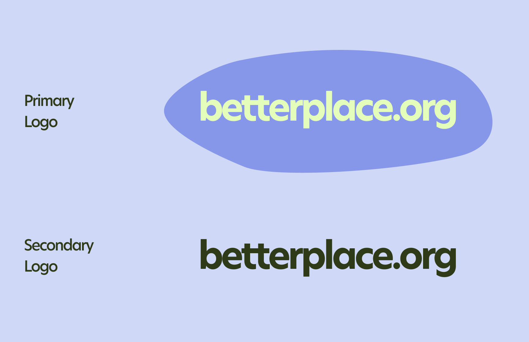
We also re-designed a primary and secondary version of the logo. We wanted to create a brand mark that is simple and accessible by removing the heart shaped symbol and making all the letters of the name the same font and size and colour. We chose the letters to be close together and also a blue blob in the background to represent the mission of connectness and support represented by the betterplace.org projects, but wanted the blob to be uneven and unequal - just like humanity can be.
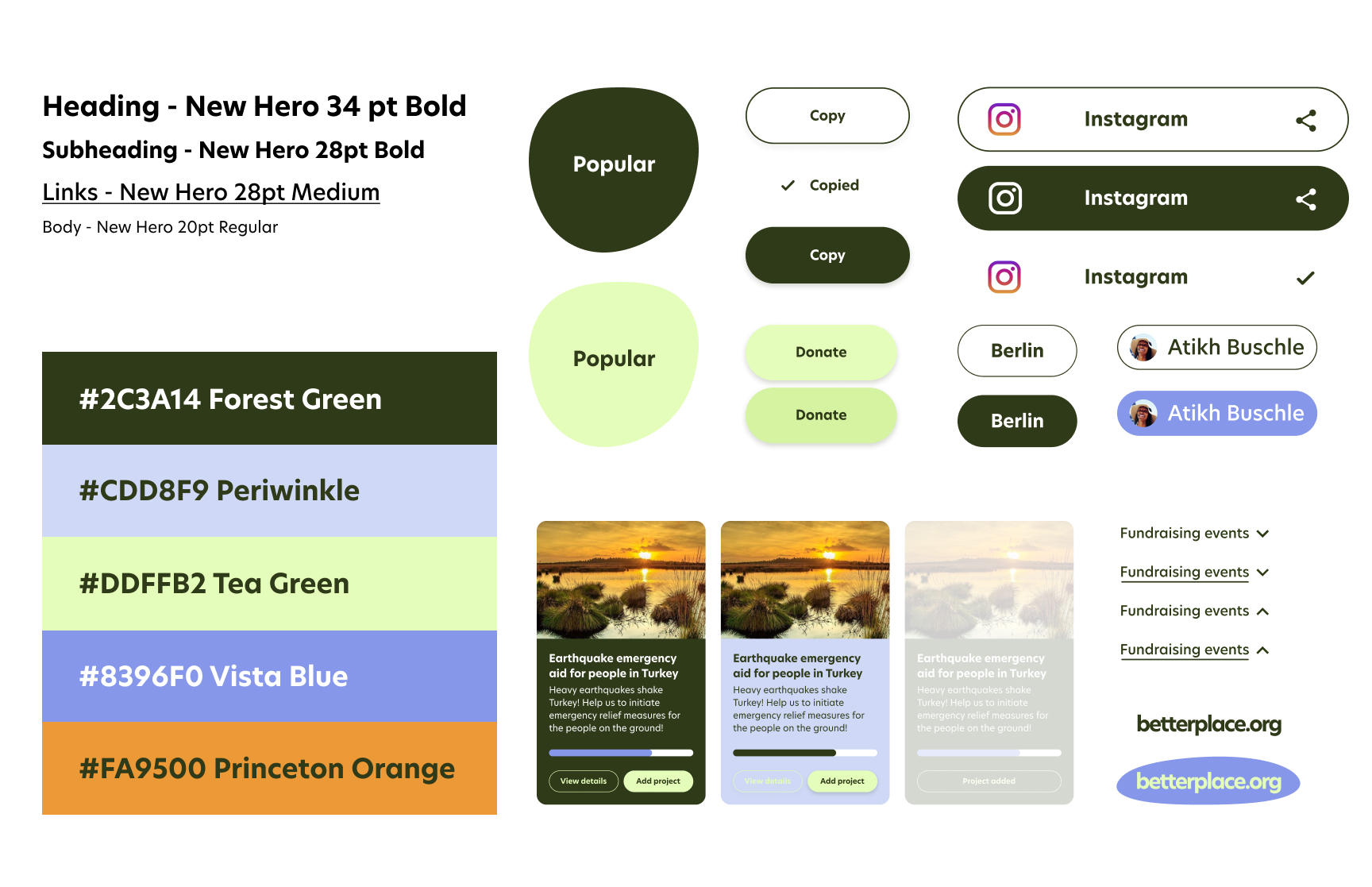
We designed UI elements that are round, approachable, and easy to read. We also designed a range of default, hover, and active states for project the cards, search filters, project categories, CTA buttons, nav bar menu drop-downs, and account login status.
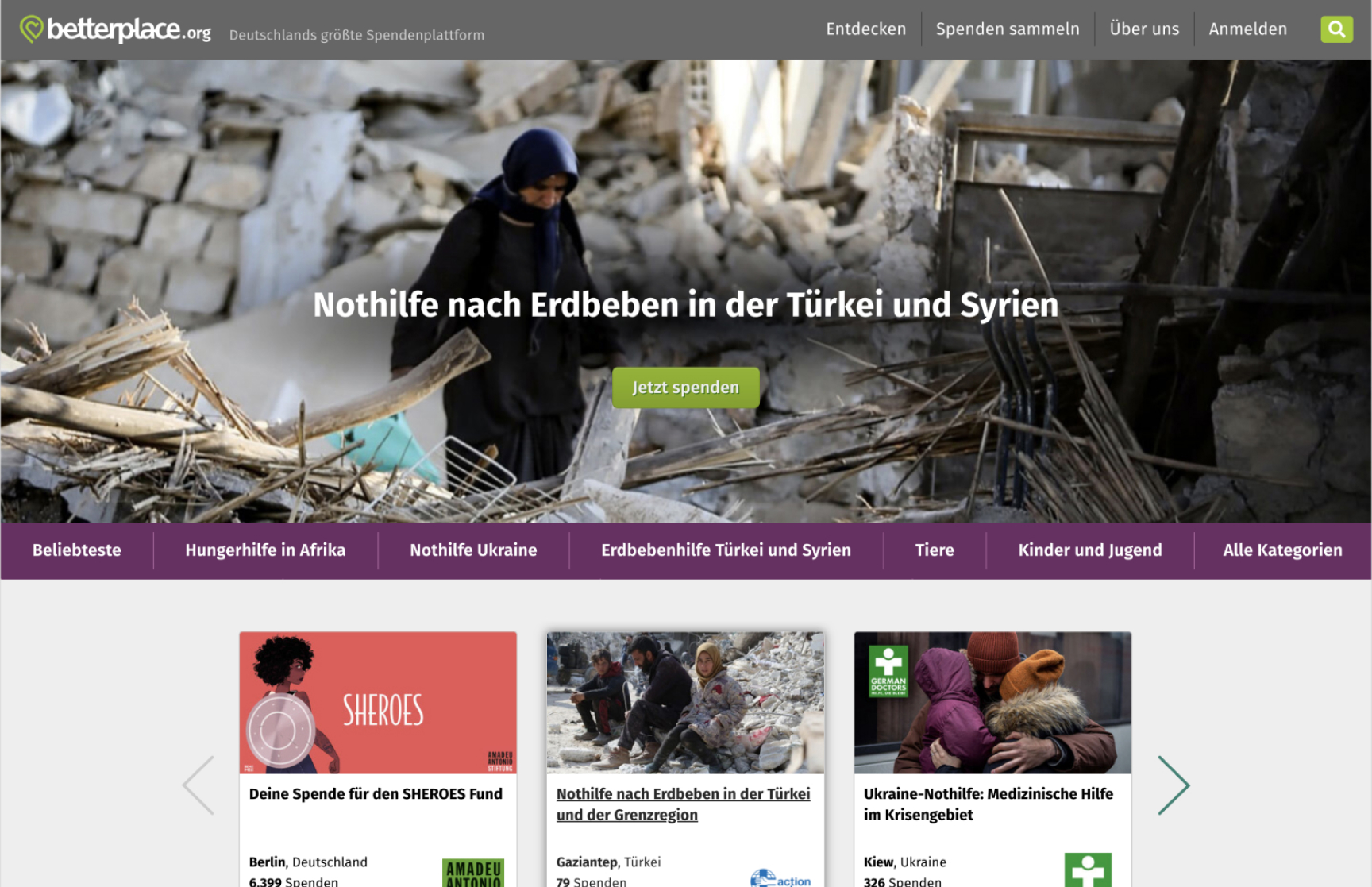
The three core user functions of betterplace.org are to donate, to create a charity project for other users to donate to, or to create a fundraising event to raise donations for a charity of their chosing. Our task was to improve the user flow on the desktop website specifically for Content Creators looking to create a fundraising event. Content Creators are a new target fundraiser group for betterplace.org that they see has a high potential for raising large amounts of donations. The screenshot to the right shows the homescreen of betterplace.org at the time of the start of the project in March 2023.
We found in our research that content creators are people who have social media accounts with a follower count ranging from 1,000 to over 1 million. They can be active across a range of social media platforms, which include Instagram, TikTok, Twitter, YouTube, and Facebook.
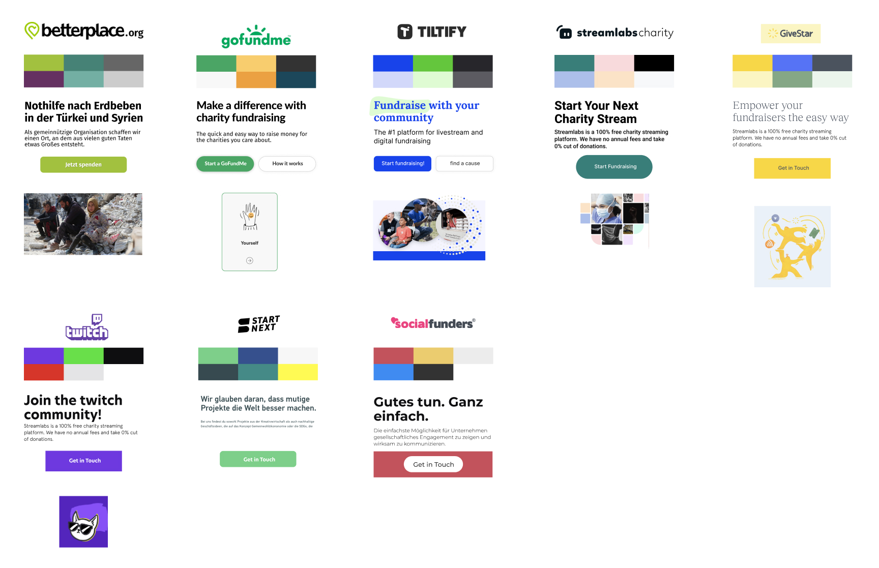
The main competitors of betterplace.org have similar features, though they have the advantage of intergrated social media sharing options and also easier step-by-step fundraising event creation flows.
The visual branding of betterplace.org looks dated and muted compared to it's competitors who use a more contemporary and eye-catching colour palette and imagery which really speaks the language of content creators. The imagery betterplace.org uses on its homepage - although unfortunately the reality of the times we live in - doesn't inspire hope for the user to make a change and donate. The competitors however often use a combination of positive imagery and illustrations which feels empowering and uplifting.
We conducted five user interviews with content creators in our own networks, with the main goals of understanding how content creators spend their days, how they find out about social causes to support, how they become attracted to fundraise for a social cause, and what might prevent them from particiating in a fundraising event.
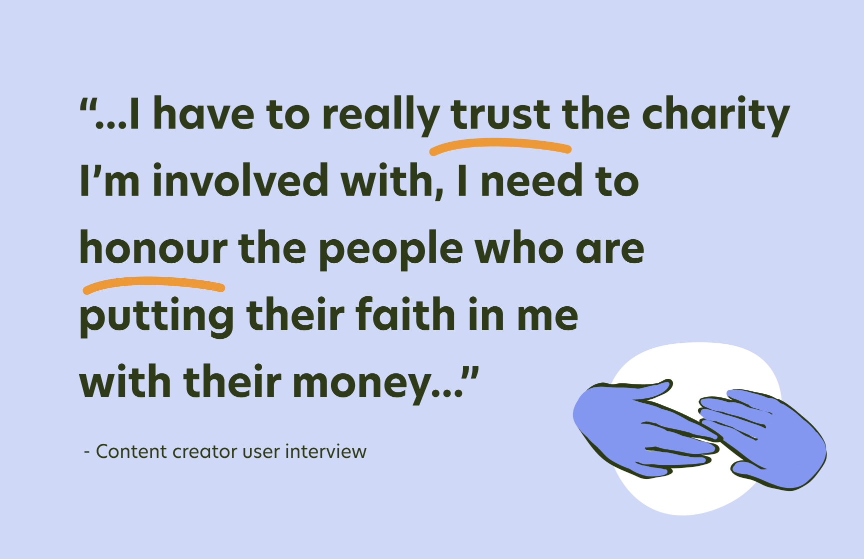
We found that content creators need to be able to trust the charity and fundraising platform, that it is a reputable company, and that it's clear where the money is going and the tangiable impact it is having, and what percentage the charity ultimately receives. They feel a social responsibility for their followers and also care about their own repututation. Content creators also are emotionally driven and want to support a charity that speaks to their heart.
Our research lead us then to identify the key themes that content creators need for them to fundraise for charity:
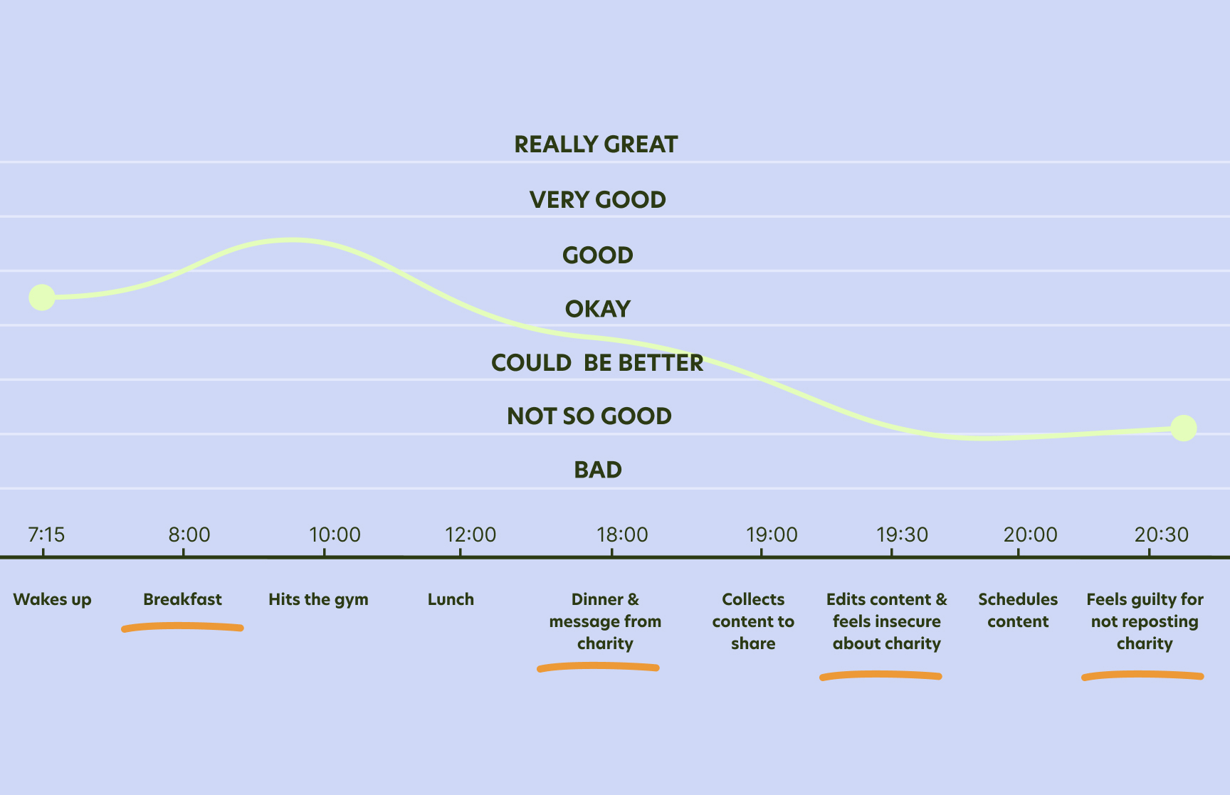
We imagined a user persona for betterplace.org, Atikh Buchle. She's a food and fitness content creator with a following of over 5,000 on Instagram. She's 24, living in Berlin, and interested in dining out, cooking new recipes, yoga and of course keeping up-to-date on social media. She wants to use her influence to help people and to find a cause that touches her heart, and is looking to make an impact with her influence whilst also fostering a sense of community in the process. Though she feels insecure about how the money she fundraises will be spent and so would want to use a trustworthy platform to do so.
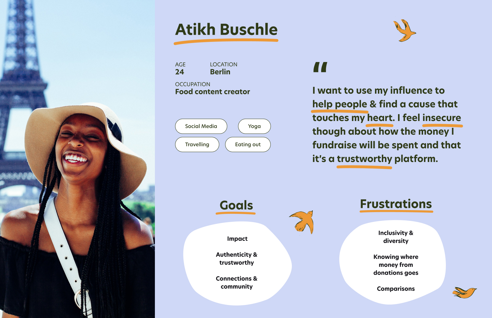
Almost every part of Atikh's day would revolve around content creation, from taking photos of her smoothie bowl in the morning to when she's at the gym where she would make sure to choose an exercise machine with good lighting. At lunch she would try out a new healthy recipe and again would take photos. Whilst making dinner, she would potentially receive a message from a charity asking her to share one of their posts to raise donations. Although she likes the idea of using her influence to help out a charity, she doesn't recognise the charity and so feels insecure about sharing it. Ultimately she decides not to reshare the charity's post, but feels guilty about afterwards and wishes there was a way to feel more secure about sharing fundraising events.
After empathising with Content Creators, we were then able to identify two key problems:
This led us to the following two key questions:
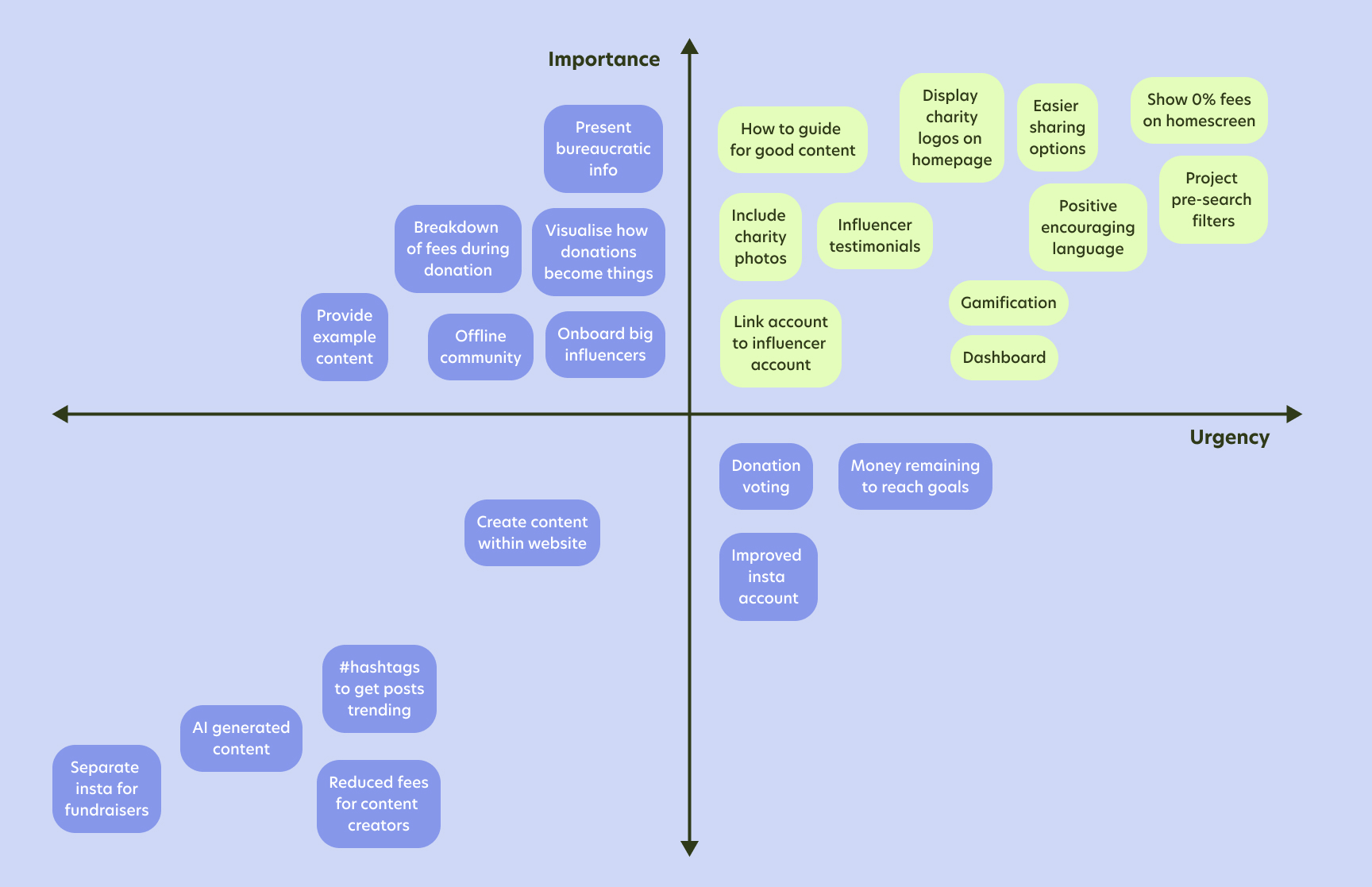
Armed with these key questions, we set out brainstorming potential solutions - which we had plenty of! We used a feature prioritisation matrix to decide on both the most important and urgent solutions, highlighted in green.
We next turned our attention to the current betterplace.org website and how the existing user flow is for Content Creators to create a fundraising event.
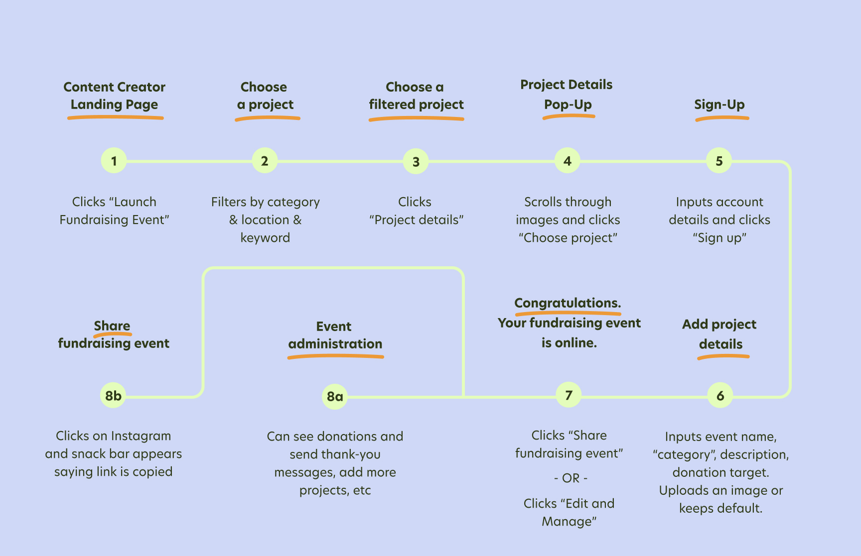
Though the flow is quick to complete and simple to navigate, we identified a few key problems:
We wanted to make sure that these problems were addressed and improved upon in a new user flow. Though the flow is several steps longer, we wanted to break down the steps into easier more managable pages to give the user time to breath and focus on one or two tasks at a time, inspired by the flow we had seen in the competitors websites.
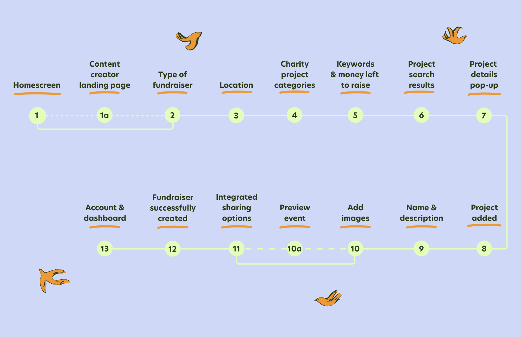
The improvement we made are:
Using this user flow, we began to sketch out some wireframe designs for the desktop website, whilst also including initial sketches of the ideas we had decided on in the feature prioritisation matrix. We were influenced by the GoFundMe design for filtering the projects, as we particularly liked the simplicity and structure of the pages that guide the user through the several project filter options and also setting up the fundraising event. We only had time to test the paper prototype with one user as we felt pressed for time, and unfortunately the test wasn't so insightful. In hindsight, we could've tested the prototype more at this stage, especially since we had increased the length of the user flow.
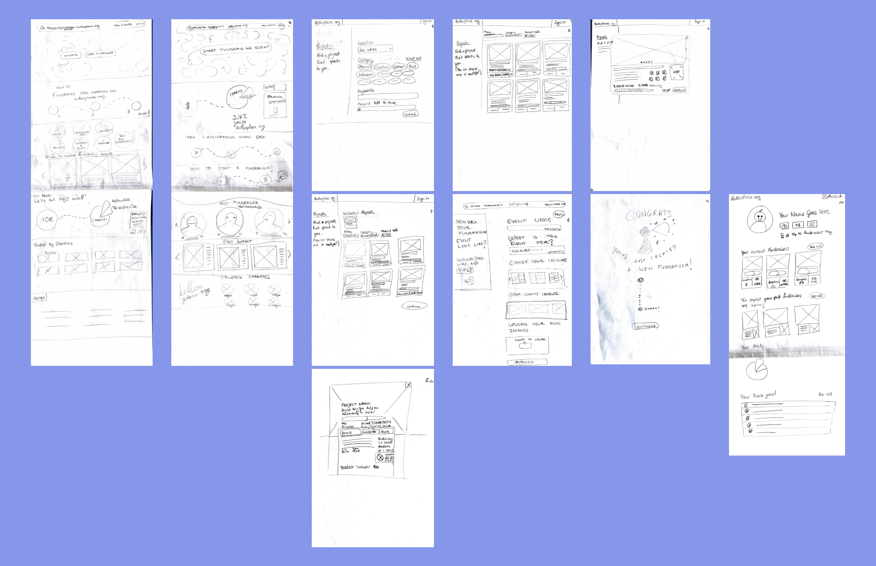
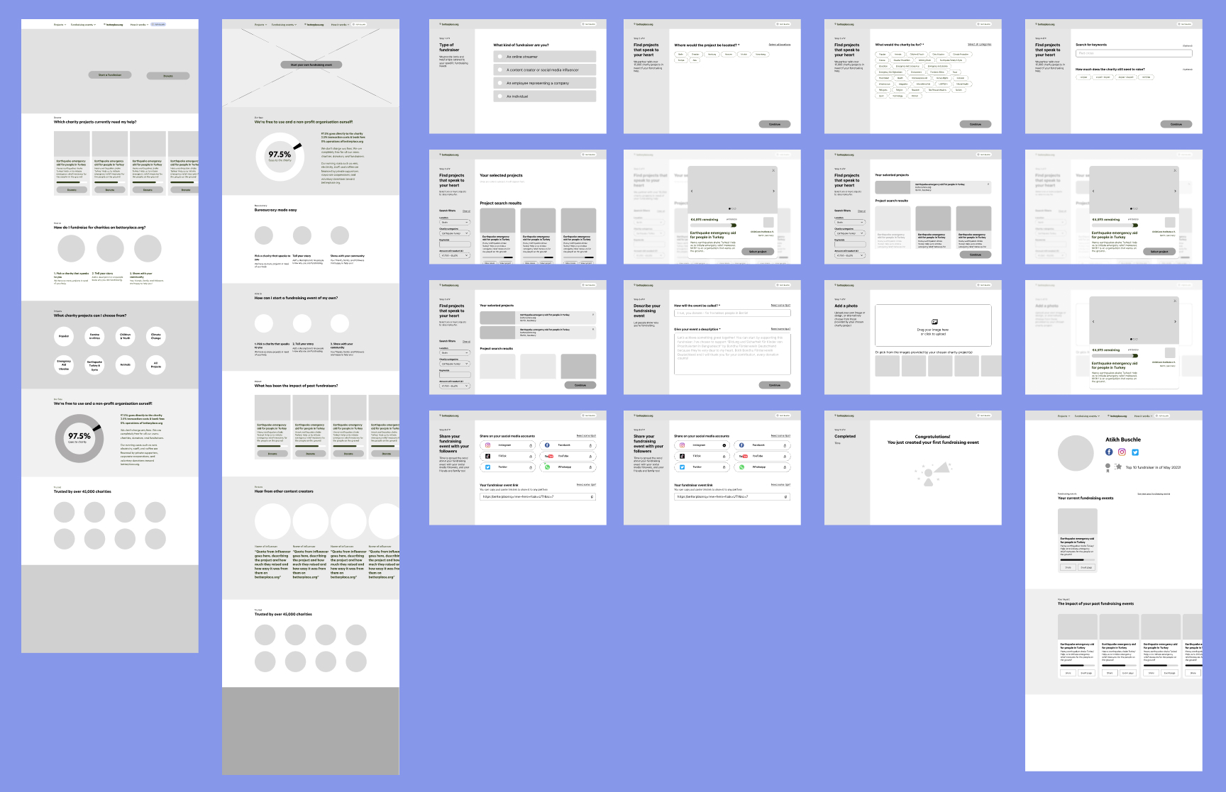
We translated the paper sketches to Mid-Fi wireframes in Figma. We broke down the event creation steps even further as we recognised that both the project filter screen and the event naming screens appeared quite cluttered on the paper prototype.
When testing the Mid-Fi prototype, we had the feedback that the flow felt understandable and easy, and people liked how easy it was. The test users found that they initially clicked on the "start a fundraiser" button on the homescreen first, instead of clicking "fundraisers" in the nav bar menu to navigate to the landing page specific for content creaters as we had prototyped. To resolve this, we designed an additional flow where the user could additionally click on "start a fundraiser" and then would be guided to a separate screen with the option to choose the type of fundraiser they are as "content creator", before then joining back to the original content creator fundraiser event creation flow. The test users wanted more feedback on the social media sharing page to clearly indicate when the event had been shared, so we designed a check box to appear once it had been shared and also for the "next" button to only appear once the event had been successfully shared.
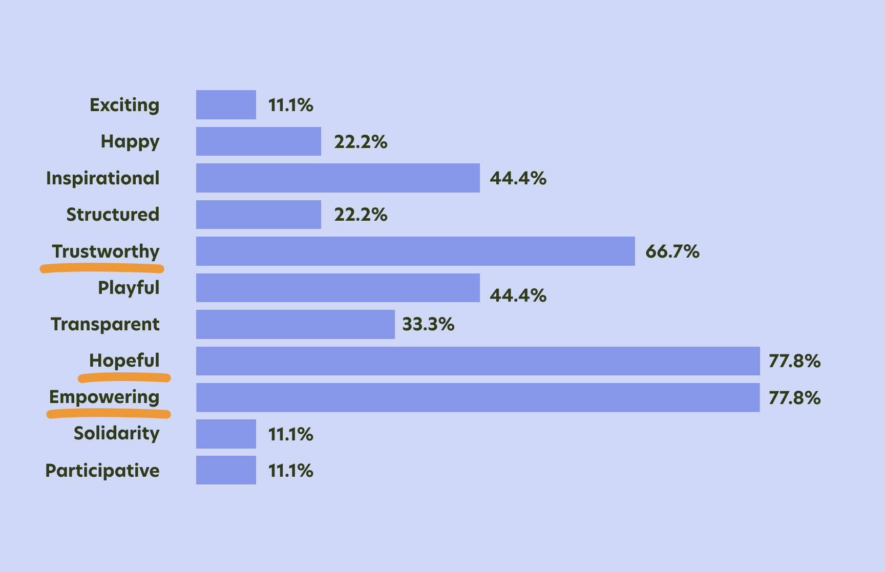
We then moved onto thinking about the brand attributes for the rebrand. The existing betterplace.org brand attributes are "Trustworthy", "Transparency", "Easy", and "Empowering". We decided to keep both "Trustworthy" and "Empowering" as we thought they were reflected well in our user research, and additionally included "Hopeful" to emphasise the need for positive imagery and language thoughout the design.
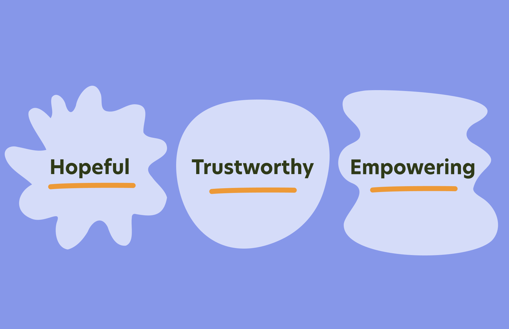
We created a moodboard with references to reflect these brand attributes of "Hope", "Trustworthy" and "Empowering". We chose images of hands to show community and the togetherness of the people involved in the fundraising campaigns. We chose a colour palette of shades of light to mid blue, yellow green, dark green and pops of orange. The majority of the design would be blues and dark greens create a feeling of security and safety, whilst pops of the yellow green and orange bring a hopeful and joyful warmth to the design. We chose references for the typography that are sans serif, wide and rounded to again convey trust and also easy to read and not distracting from the the core fundraising and donating functions of the website.

When we tested the moodboard with a user survey, the highest scoring attributes reflected those of our chosen brand attributes which we were happy to see. This gave us confidence to then move ahead to designing the Hi-Fi prototype.
We presented the research and hi-fi prototype to the UX Designer at betterplace.org, gathered our thoughts on our learnings from the project and what we would do next had we had longer than two weeks.
The UX Designer at betterplace.org gave us the feedback that she really liked the design. Though it won't be possible to implement the design at the time due to limited engineering capicities at betterplace.org, she found the user research to be really valuable, and the ideas and features we came up with she will be sure to test out in her future work, and will let us know if any of the designs are implemented into the website in the next years once the engineering capacities are increased.
Had we had more than two weeks for the project, we would love to have done more user testing at all stages of the prototyping to understand the feedback from users, and whether our design solved our problem statements. We also would have loved to have included a section on the content creator landing page with a simple overview of freelancer bureaucratic information and also further visualise how fundraising donations become real tangiable results, as these themes came up several times during our user research.
We learned a lot during this two week student project, mainly client expectation management as there seemed to be some confusion about how much involvement the client would have during the school project, which we addressed during the project and also in a feedback meeting after presenting the design to betterplace.org. We also defined our own goals as the initial project brief was just to map out the existing user journey for content creators and companies, which we then suggested we could actually focus on just one user content creators and do more for them by redesigning the whole betterplace.org branding as well as the user flow for content creator fundraising events. Lastly we also learnt how useful it is to priorise the many ideas we had using a feature prioritisation matrix, which helped us focus on only the most important and urgent ideas.